Website Revamp: Ushering in a New Era of User-Centric Web Experience

Our client is embarking on a project to redesign its current website to address significant challenges in usability, solution presentation, and user engagement. The existing site struggles to effectively communicate the client’s offerings and lacks the interactive features necessary to engage potential clients, resulting in missed opportunities for lead conversion. With a focus on improving performance, responsiveness, and clarity, the goal is to create a visually appealing, highly functional website that showcases their value propositions.
Headcount

1 PM, 2 UI/UX designers, 1 developer

Industries

IT services

Products and Services

UI/UX Design, Website Development

Timescales

Ongoing (since June 2024)

Country

United Kingdom

Business Overview

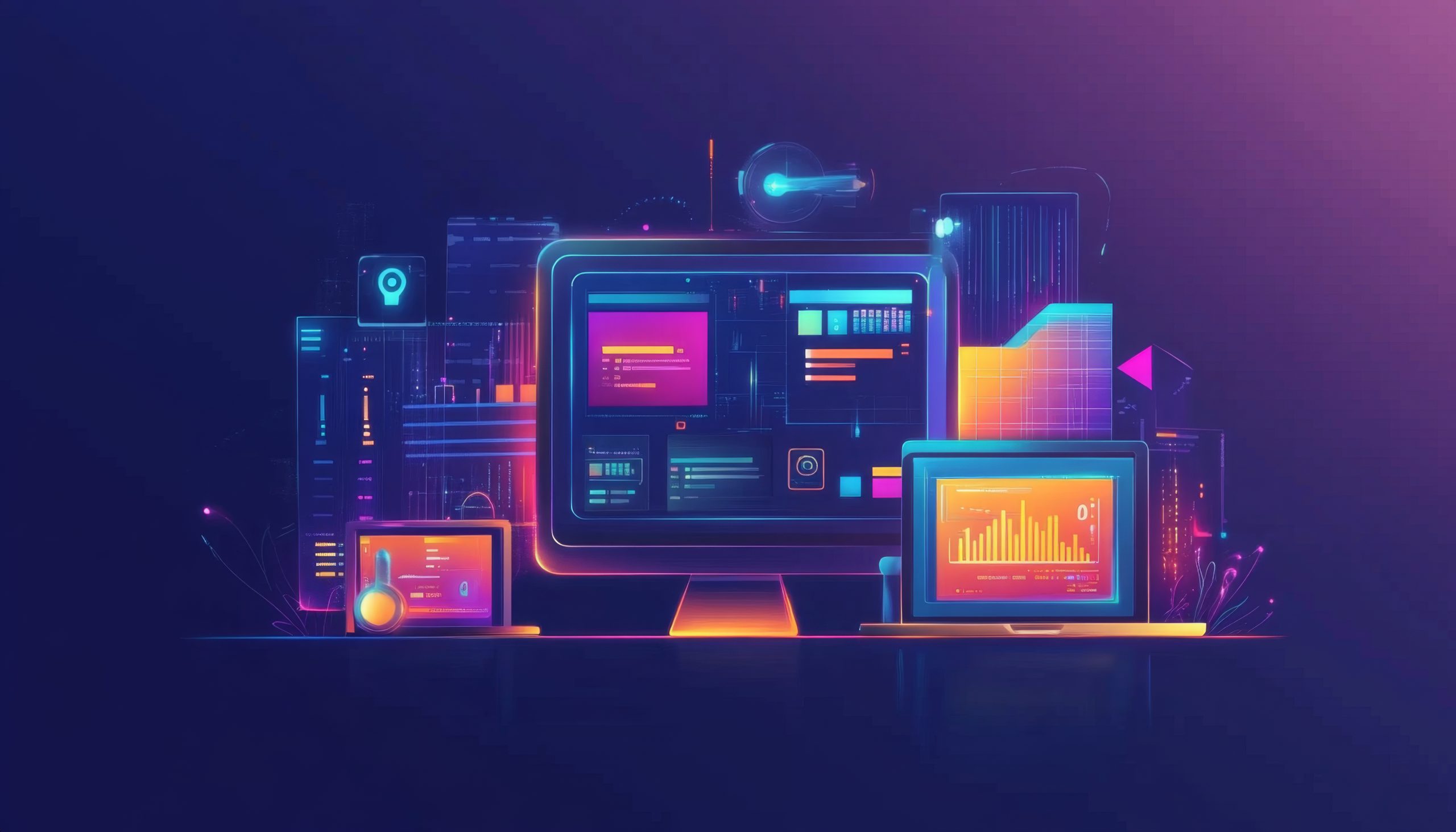
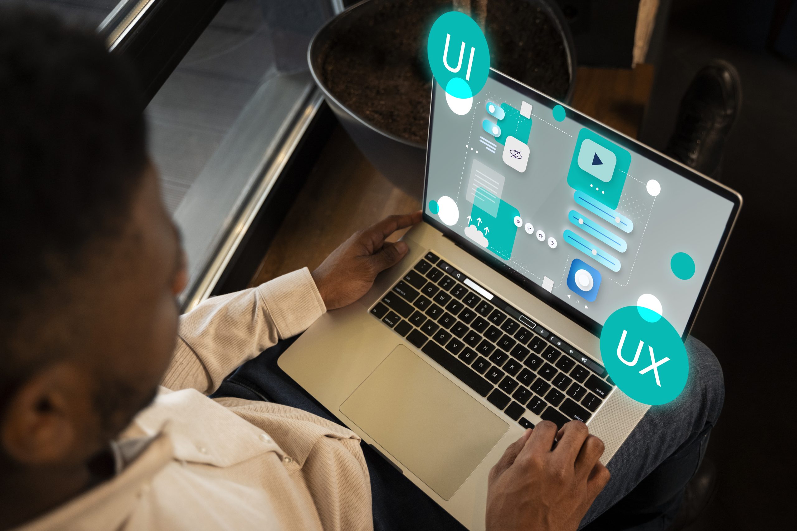
The client’s current website struggles to clearly communicate its solutions, resulting in missed opportunities to attract and engage potential clients. A lack of clarity, interactivity, and effective content presentation has diminished the platform’s role as a key digital touchpoint.

To address this, the client is pursuing a full redesign focused on improving solution visibility, user engagement, and overall functionality, while staying within budget and timeline constraints. The goal is to build a modern, responsive, and easy-to-update website that better reflects their value propositions and supports long-term growth.

The challenge

Our client faced a significant challenge in redesigning its website to address current shortcomings while adhering to tight time and budget constraints:

  • The existing website struggles to effectively present the client’s solutions to visitors, leading to confusion and missed opportunities to engage potential clients. It limited user engagement and inadequate solution representation diminish its effectiveness as a primary digital touchpoint.
  • The overall goal for them is to deliver a visually appealing, interactive, and highly functional website that meets both business and technical requirements while staying within budget and time limitations. The redesign should resolve current issues with solution visibility and user engagement, creating a site that better represents the client’s value propositions.

The solution

  • Phased Development Approach: Start with a Minimum Viable Product (MVP) that focuses on delivering essential features like core service pages and basic functionality. A flexible CMS like WordPress will enable easy updates and expansions, allowing new features to be added in phases as time and budget permit.
  • Responsive Design: Adopting a mobile-first design ensures that the website functions seamlessly on all devices, from smartphones to desktops. Key elements such as navigation, forms, and CTAs should be optimized for smaller, touch-based screens.
  • Optimize Performance: Improving website performance involves compressing images and media to reduce load times without sacrificing quality. Implementing lazy loading for offscreen content ensures faster initial page load times.

Technology Stacks

WordPress
HTML
CSS
Figma

Application Core Functions

Boost User Engagement

Integrate interactive elements like testimonials and dynamic CTAs to encourage real-time communication and keep users engaged.

Enhance Lead Conversion

Implemented a comprehensive mapping system to align internal food IDs with external systems, ensuring seamless data integration across platforms.

SEO Optimization

Apply SEO best practices by optimizing metadata, using relevant keywords, and ensuring mobile-friendly design. Regular technical SEO audits will help improve visibility and drive organic traffic.

Client Achievements

Phased Approach

Start with a Minimum Viable Product (MVP) that focuses on delivering essential features like core service pages and basic functionality. This allows for a quicker launch while meeting immediate business needs. A flexible CMS like WordPress will enable easy updates and expansions, allowing new features to be added in phases as time and budget permit.

Responsive Design

Adopting a mobile-first design ensures that the website functions seamlessly on all devices, from smartphones to desktops. Key elements such as navigation, forms, and CTAs should be optimized for smaller, touch-based screens. This approach guarantees a consistent user experience, improving engagement and reducing bounce rates across all platforms.

Optimize Performance

Improving website performance involves compressing images and media to reduce load times without sacrificing quality. Implementing lazy loading for offscreen content ensures faster initial page load times.

Get Started

Have a Project in Mind?

With SmartDev, you can find a range of fintech competencies to help you scope, design and build your ideal product or solution. Share your vision with us and we will get back to you the following working day. Our experts can help your business unlock potential and unleash innovation.

Let's get started today

Subscribe to our Newsletter

Stay ahead in the tech world with SmartDev! Subscribe to our newsletter for the latest IT news, updates, and insights.